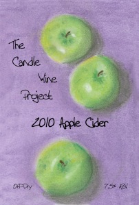
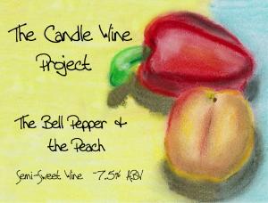
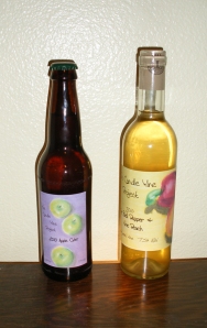
While I was at my local homebrew store getting bottles for use in the fair, I decided I would go ahead and get some wine labels to print on rather than use my string method. The store sold different sizes from Classic Studio. Part of the attraction to this was that I could get a label to stay on for a few months, but it would come off easily with a little bit of soaking.
I would not recommend purchasing these labels unless certain things were done.
First off, I was smart in that I would design the labels and then print on regular paper and then hold it up to my labels to see how the margins turned out. It took me two hours to finally have something acceptable, but not perfect. These days, so many pieces of software use Avery to guide the margins, and Classic Studios did not. Classic Studios did provide me with what the margins are, but they were things like 5/8”, which is 0.625 inches. The software I was using did not like three decimal places, and kept truncating it to 0.63 inches, and therefore moving it a sixteenth of an inch and messing it up.
There are two work arounds for this issue. The first is that you can actually design labels on Classic Studio’s website, in which they would print them off and mail them to you for a fee. Since I already had the blank labels, this was not an ideal situation. The other work around is to pay about $40 for software from Classic Studio that allows you to design and print off labels. Call me cheap, but I didn’t want to go that route. In the future, I’ll stick to using Avery labels in the future because of ease of use. Actually, I probably put too much work into the labels for that competition, as I saw others just write on paper and use tape to stick it on, and it worked for the competition without all the frustration of trying to make a label that I went though, especially since the bottles were not going on display. Mine did look nice though.
I did recently go back to the store that I bought the labels from, and they had the packages on sale for $5. I told them it was tempting, but too difficult. One clerk agreed, and said that the store did have the software and would allow me to use it if I wanted to. I’ll keep that in mind to use up the rest of my label stock.
As far as the design goes, I went online looking for pictures of apples and then a bell pepper and a peach. I found lots of apples, but no bell pepper and peach in one picture. However, I found an artist named Carol Marine who did a small painting a day in sort of an impressionist style. Now I have a little bit of artistic talent, and I decided that I would give a try at drawing a bell pepper and peach in this style. I’m not as good as her, and I was using pastels instead of oil paints, but I’m fairly pleased with the drawings. From there, I scanned them into a computer and made a few touch ups, and adjusted the framing for the label. However, I was a little disappointed with the final outcome, as I lost the shadows a bit on the apples, and the printed yellow on the label does not show any “brush strokes,” so some of the hand drawing quality that I was attracted too was lost. Not that I’m talented enough to draw like that on a computer anyway, but computers sometimes leave things too sterile, as it has the same color everywhere instead of a variance due to pressure, thickness, and smudging of the medium.
Anyway, here are my first labels:
I used a font called Tall Paul. I wanted something whimsical yet unisex, that is to say, fun but not flowery. It is a smaller font, and I find it sometimes needs to be spread out when I use it.
Classic Studios did offer one piece of very good advice when it came to adhering the label. They told me to find a striped towel and lay it flat on the counter, and then lay the bottle on the towel. I then used the stripes on the towel to help guide the placement of the label so that it went on straight.
In hind sight, I probably won’t use such big labels on 375mL bottles again…


No comments:
Post a Comment